WHY IT’S TRENDING

Among the trend drivers that inspired this color choice is that of mindful living — slowing down time and injecting restorative design to appreciate small moments. Color that is restful to the eye is restful to the soul.

In the coming year, we will redefine our notion of neutral hues. Going beyond the classified color term, neutral refers to colors that set a grounding and inviting mood with the warmth that calms our senses.

– Sue Kim, Valspar® Director of Color Marketing
HOW TO STYLE

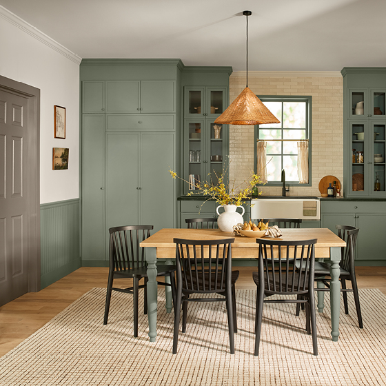
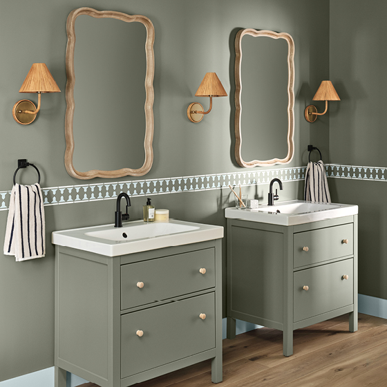
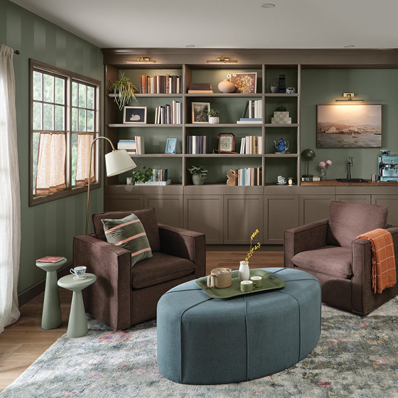
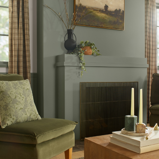
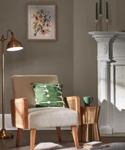
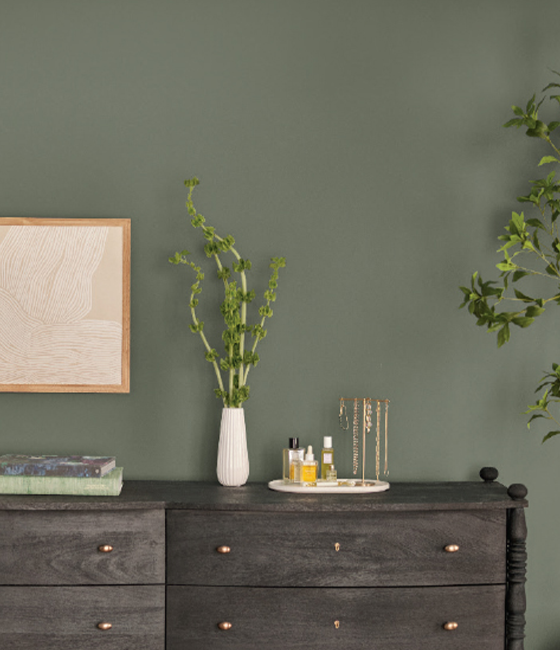
Our home is working harder than ever to support a multi-generational, multi-species, hybrid hub of living, working and entertaining. Indoor and outdoor boundaries continue to blur, which will emphasize the nature-inspired, restorative colors while curating personal styles. When styling, think organically, with ceramics, wood, bio-based, sandy, gilded gold, etc.

COORDINATING COLORS

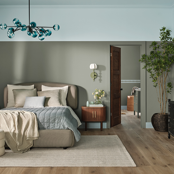
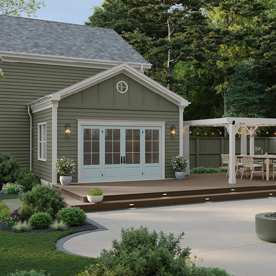
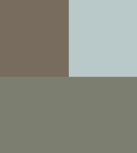
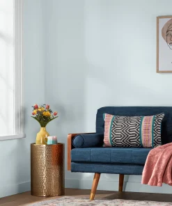
Bring on the gray influences. Subtle Degas Blue is warmed by undercurrents of green and calmed by subtle gray. Deep-brown Groundbreaking is a cozy hue with a gray undertone. Together with Warm Eucalyptus, they bridge the natural world from ground to sky.

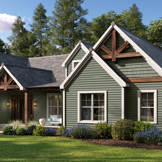
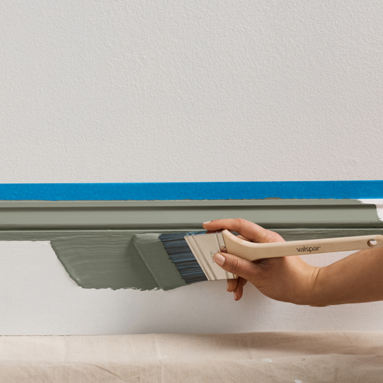
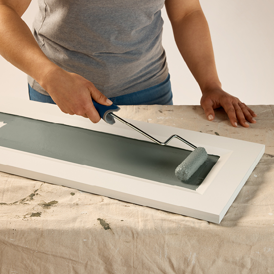
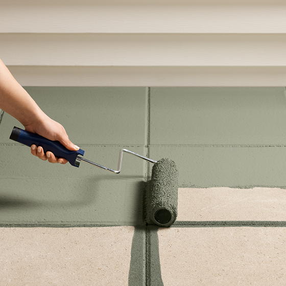
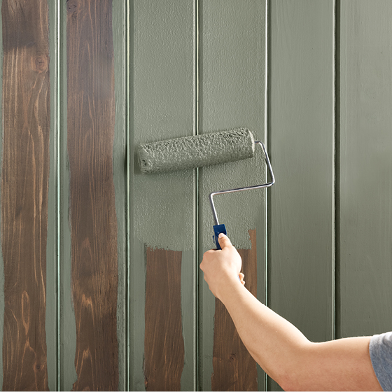
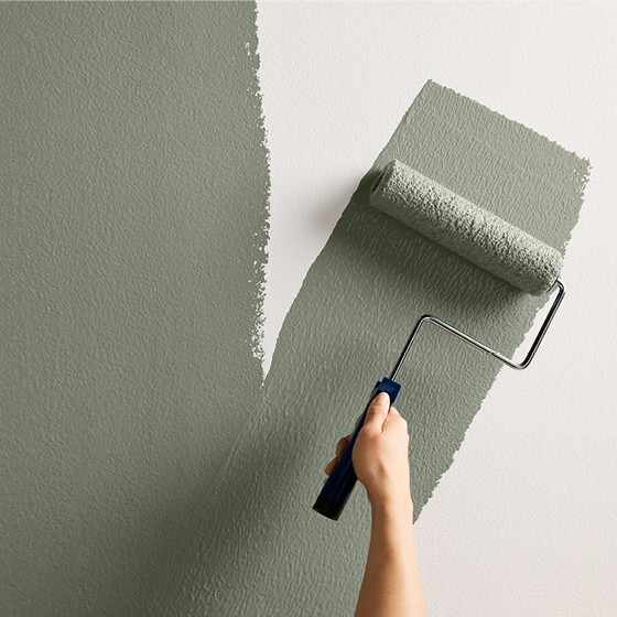
From paints to stains, our tintable products let you apply Warm Eucalyptus everywhere you want to experience this calming color. Roll, brush or spray Warm Eucalyptus on walls, doors, cabinets, furniture, concrete, wood and more.

VISUALIZE WARM EUCALYPTUS IN YOUR HOME

Try out Warm Eucalyptus on a virtual wall — or in your own spaces. And explore new ideas for your next project.

THE COLORS OF THE YEAR 2025

Scroll back in time to see the colors that defined 2025.